A tour of Media Shuttle’s recent design updates
Since its introduction in 2012, Media Shuttle has been changing the way that M&E professionals access and share media assets, facilitating the secure movement of files along increasingly dynamic supply chains. Part of what has made Media Shuttle so popular among media organizations of all sizes has been Signiant’s continued commitment to making the software as user-friendly as possible. Customers love its brandable portals and that it’s so easy for new users to learn that the application can be rolled out to creative end-users without any training at all. As Media Shuttle continues to grow in functionality to support even the largest media companies in the world, a key challenge is to offer that enterprise-grade power without losing its elegance and ease-of-use.
With this in mind, Signiant is thrilled to announce the debut of a number of user interface updates. Improvements have been made to the look and layout of all three Media Shuttle portal types — Send, Share, and Submit — to ensure fluidity and consistency.
At the same time, we want to acknowledge that changes to a familiar application can provoke some worry that a workflow that’s become second-nature might turn alien. Rest assured, these changes have not removed any of Media Shuttle’s rich functionality or security. And your portals are still as easy to use and as customizable as ever. What we think you’ll find is that these subtle UI enhancements make the Shuttle experience even more intuitive and streamlined than before.
So welcome to the new look of Shuttle. Let’s walk through what’s new!
A modernized look across portal types
Over the last few months, we’ve been designing a modernized look for Media Shuttle, making small adjustments to arrive at what would work best for our customers. A quiet round of initial changes was focused on improving accessibility and contrast through updates to color themes, fonts and logo styles. These initial tweaks were all but invisible to most of our Media Shuttle customers as the color theme updates applied to the default Media Shuttle portal look, and one of our customer base’s favorite features is the ability to customize the look of their portals. You’ll only see the color changes implemented if your portal administrator elects to reset the site design to its default look.
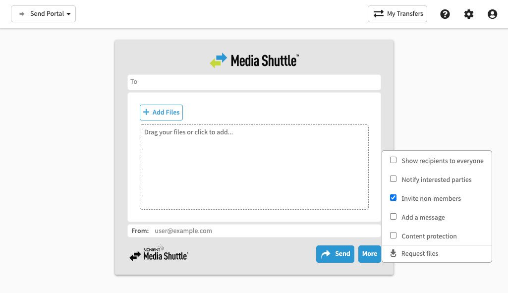
A new layout for menus and buttons
Top navigation bar layout
Portal Menu:
The Portal menu, where the user can switch from one portal to another, used to be sandwiched between the My Transfers menu and the Options menu (which previously contained a variety of links and functions) on the upper right of the portal window.The Portal menu has been moved to the top left of the portal window, on its own, so that it’s easier to find.

File Search
In Share portals, the Search function now appears top center in the portal window.
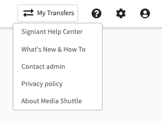
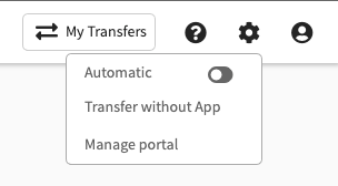
Help, Settings and User Menus:
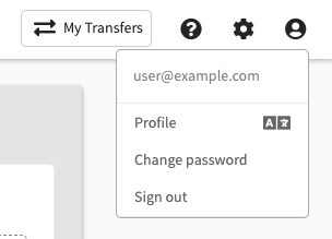
All the actions and links that used to be in the Options menu have been split into shorter Help, Settings and User menus at the top left of the portal window. Menu items are grouped in a more intuitive way for quick discovery.
Button placement
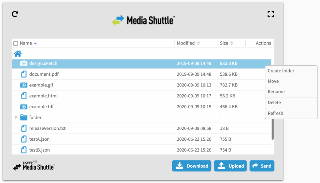
The blue buttons indicating major Share portal functions were previously placed above the file selection area of the portal panel. These buttons have been moved to the bottom right of the panel to better reflect the user’s workflow, in which they select a file or folder first and then choose what to do with it.
All file- and folder-specific operations that are available in your Share portal can be found by right-clicking on a row in the portal panel.
Media Shuttle: Growing with the industry
This newest round of changes to Media Shuttle are specifically tailored to make it easier than ever for M&E professionals to work quickly and efficiently. With more than 25,000 media companies trusting Signiant software to move their valuable content, we understand that providing a seamless user experience is critical. We strive to provide enterprise-grade SaaS solutions that are rich in capabilities while ensuring easy deployment, operation and use. These recent enhancements to Media Shuttle were designed to do exactly that.

